07 / BRAND IDENTITY
Ready Fleet Go
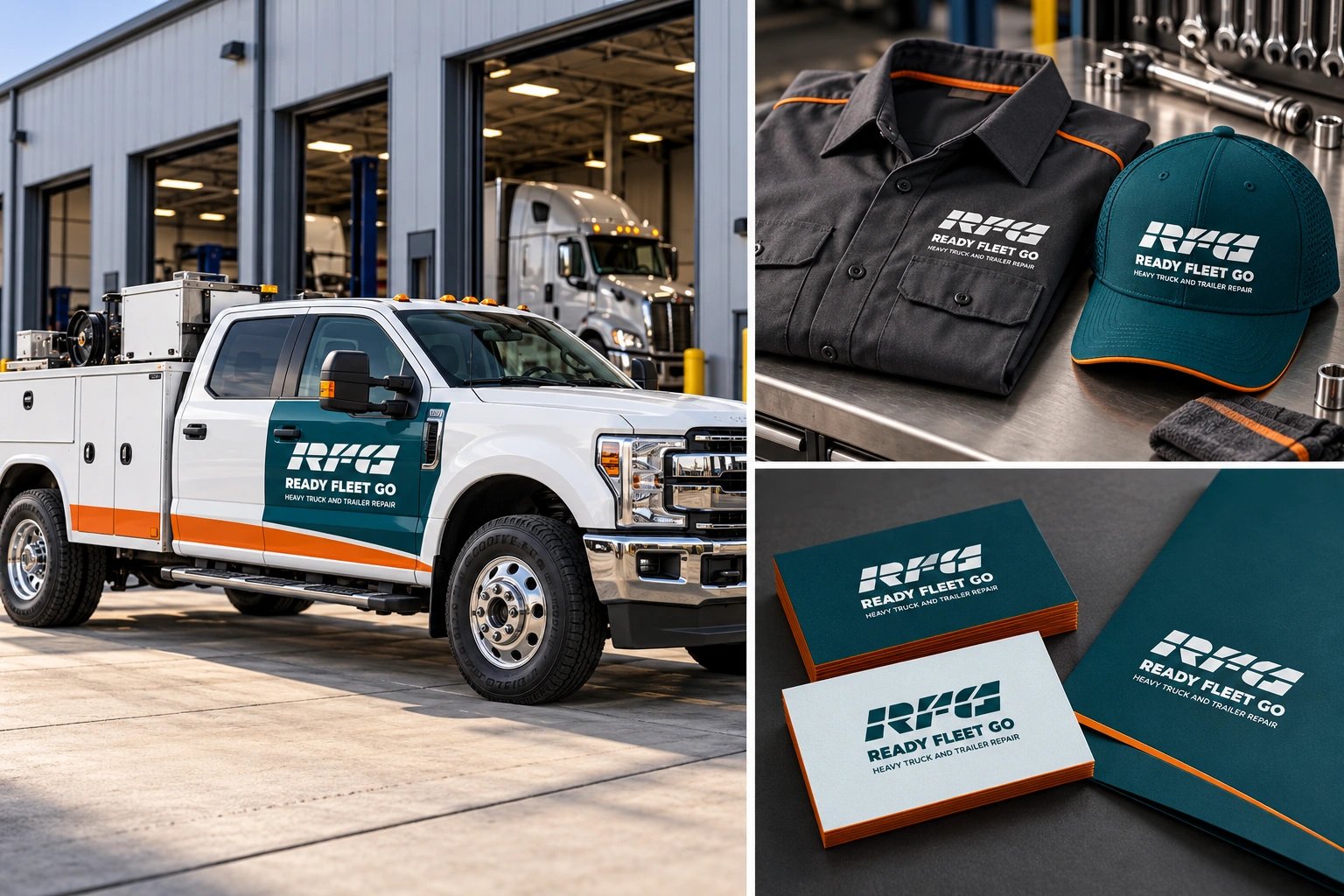
Heavy truck & trailer repairA bold industrial identity built around keeping fleets moving. Strong geometry, deep teal and orange accents communicate precision, urgency and reliability.
BEHIND THE IDENTITY
Ready for the road.
Built for continuity.
An identity that positions maintenance as a partner in business performance.
Keeping business moving
The brand centers on the cost of downtime. Its story connects precision diagnostics, operational continuity and long-term reliability to the needs of fleet owners.
Strength in motion
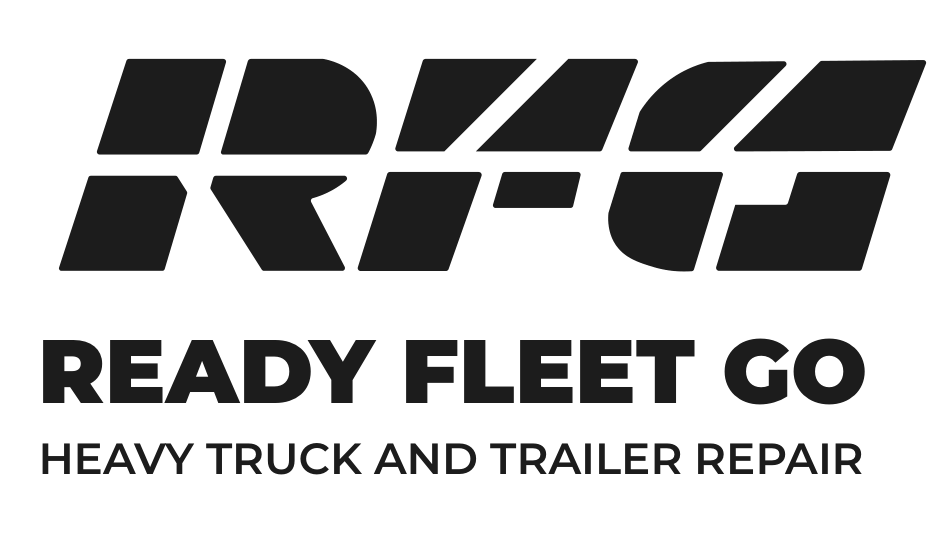
The bold, forward-leaning RFG monogram suggests speed and resilience. Mechanical cuts and a clear three-level logo hierarchy reinforce its industrial character.
Precision meets energy
Deep teal provides a grounded foundation. Orange adds urgency, while pale gray, charcoal and black support a clear, practical visual system.
Direct and dependable
A concise, confident voice translates technical expertise into accessible communication. Coordinated stationery and uniforms carry that presence into everyday touchpoints.